University of British Columbia
Website Redesign
Summary
The Centre for Collaborative Research on Hoarding is a multidisciplinary research group based in the University of British Columbia's (UBC) Department of Psychology.
Timeline
April – September 2023
Role
Website Designer and Developer
Tech Stack
Adobe Illustrator
Figma
Wordpress
Concept

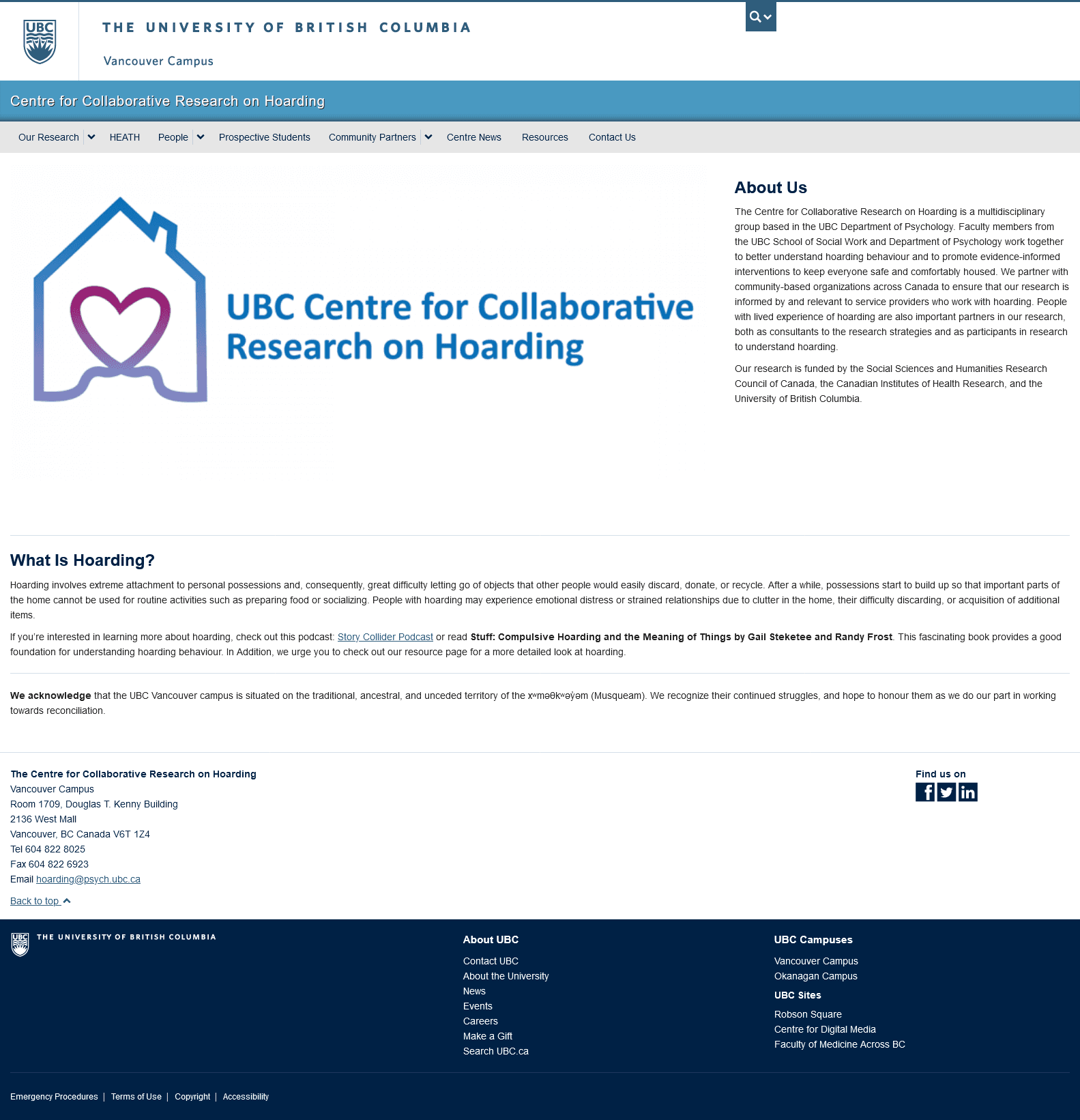
Before

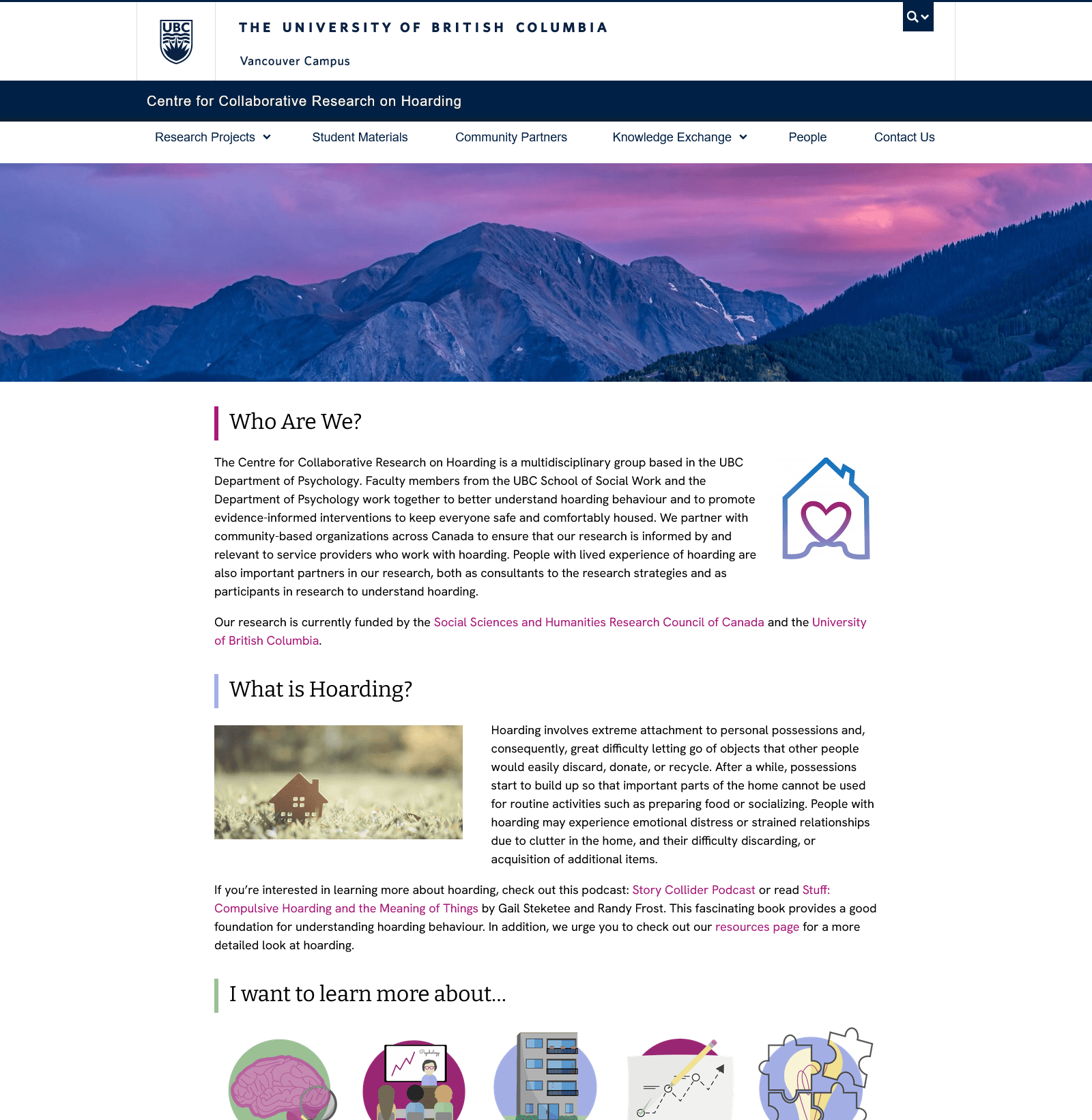
After
Concept
Researchers at the University of British Columbia Centre for Collaborative Research on Hoarding required a complete website redesign. This included the development of branding that was unique to the Centre yet still cohesive with UBC's own branding, a website prototype, custom iconography, and website creation using UBC's content management system (Wordpress).
The most important concept that was in mind when designing this website was to add "breathing room". It was important that the website visitor didn't feel overwhelmed by the volume of content on the page. Breathing room was achieved with the use of page margins and a balance between text and imagery.
The overall look and feel of this website design is modern, clean, lively, and inviting to users. Colors, fonts, and images were all chosen and developed to elicit a sense of professionalism and trust, with a hint of playfulness.
User Persona
User Persona
The goal of a user persona is to understand the background, needs, and frustrations of a typical visitor to the website. This user persona reflects a tenant support worker who works in a non-profit housing society.
One of Emily's core needs that the UBC Centre for Collaborative Research for Hoarding website provides is easy-to-access information on hoarding disorder and evidence-based assessments that she can use in the field while on the job.
User Flow Graph
User Flow Graph
The goal of this user flow graph was to outline and restructure the website's current flow in such a way that the visitor could access the necessary information by using the fewest number of clicks to get there.
In the original website flow, website visitors had to click through multiple pages (sometimes going back to the previous page in order to access another) to get to their desired content.
In the updated user flow graph, information was consolidated as much as possible on each main page and pages that held similar themes to other pages but were still functionally different were consolidated.
Colour Palette
#A81777
#90C290
#A4AFE6
Colour Palette
The feature colour of the website is medium purple which serves as a bold, uplifting colour as a cohesive base to the website.
The light blue and green colours elicit feelings of calmness and trust– important qualities of an academic organization based in mental health.
Typography
Typography
Bitter is a serif font with little variation in the stroke weight, and serifs which are as thick as the strokes. This font utilizes the traditional look of serif fonts while still incorporating the structured characteristics of modern fonts. Bitter is used in this design for headings.
Hanken Grotesk is a “sans serif” font in the traditional sense, in which there are no serifs and no stroke width variations. The font is consistent and uniform in design while taking letterform inspiration from traditional serif sources and calligraphy (e.g., “g”. Hanken Grotesk font elicits approachable, friendly, and “modern classic” feelings.)
Hanken Grotesk font is used in this design for body copy and smaller-sized text as it's observable simplicity makes it highly readable in long-form text.
Iconography
Iconography
Custom icons were developed for the website redesign. The icons were drawn using flat color (i.e., in 2D) and incorporated colors from the color palette with additional unique colors. This was done to ensure the entire design was cohesive while also ensuring each icon was still distinctly recognizable.
The bright colors used were eye-catching, and the illustrative nature gave off a sense of professional fun!
Wireframes
Wireframes
The Centre's website was first prototyped as a working sample of how the website would be laid out. This ensured that the client had a good understanding of how the new branding and styling elements would actually look on their new website and to discover issues prior to the development stage.
Some updates to the wireframe included refining element positions, component types (e.g., changing from tabs to dropdown lists), and layout to ensure that the information displayed was clear and easy to find for the website user.
Final Design
Final Design
In this final design, feedback from multiple reviews with the client and independent testing were incorporated into the prototype. For example, the Community Partners page was vastly improved from the preliminary wireframe by restructuring the body paragraphs so that they were consistent with other pages on the website, and incorporating a tabbed element to display the community partners in an easy-to-use way.
Website Development
Website Development
The Centre's website was developed using UBC's content management system, Wordpress. Working knowledge of CSS and Javascript was required to customize available plugins in order to achieve this design. Understanding how the available plugins worked and having knowledge of coding ensured the implementation of a unique and custom design for this organization.
UBC's centralized Wordpress system afforded many useful features to web developers, however, some challenges can arise with the use of such a large system. A very limited set of pre-approved plugins were allowed for Wordpress development which could have limited the unique aspect of design implementation. However, planning ahead was a skill utilized during both the design and development stages to ensure that the design was executed accurately in such a way that it could be updated through the back-end by Centre staff in the future.
